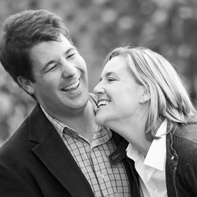
I came across this image and wanted to use it as a chance to inform people on some of the long standing "rules" of photography. To me, this image is a great example of balance between space, depth, and light. For some of you photographers this may be old news, but for some of you, it may be interesting. One of the basic rules of composition in photography is called the rule of thirds. The philosophy is that often an image looks best when it falls on the grid created by splitting the image into thirds both horizontally and vertically. It is a common design technique and frequently makes for a more interesting image. Another common way to create intrigue in an image is to have layers which help create depth. Things in the foreground and background which help give a sense of place. What I really like about this image is that it includes both. I have created the grid, so you can see what I am talking about.

If you look, the subject falls on the vertical grid and the edge of the model in the bottom right, and the model in the upper left, help add dimension. Another thing that works really well is the balance of light and dark. Your eye instantly goes to the light of the models since the background is so dark.
At any rate, I hope this was informative but not boring. I wanted to take the opportunity to give some insight into why I think this is a cool image. P.S. models and beautiful gowns help!


1 comment:
jason awesome post! not boring by any means.
Post a Comment